Explore a typographic walking route through Vancouver’s historic Gastown. View the larger map
Read MoreFebruary 26, 2011
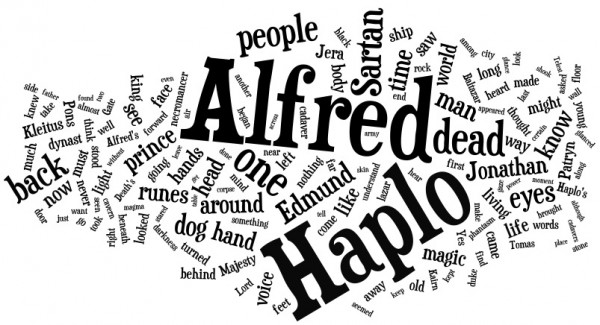
Word Cloud Project For my public Wordcloud diorama, I use visual focus to create typographic hierarchy. I experimented with a variety of lenses, including liquid-filled containers. Each printed word was identical in size. Using depth & distortion, words that are closer to the viewer will have greater clarity & focus than those further away. Source material …
Read More
Semiology: The Study of Signs: Interpretation is based on the subject & their visual language & culture; Meaning of signs can change over time, between cultures; Media and popular culture can and often do shape visual language. Guinness Semiotic Study Methodology: Guinness recruited semiotics experts to study competing beer ads; The study produced a “decoding …
Read More
Printing has evolved dramatically in response to sustainability challenges. Working as an Art Director for the first carbon neutral financial institution in Canada, I was responsible for managing printing with environmental sustainability as a top priority. To ensure your next press-run is gentle on the environment, here are some tips: Use vegetable-based inks that minimize …
Read More