January 29, 2011

Creating typographic hierarchy

Word Cloud Project

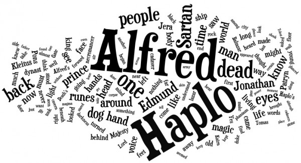
For my public Wordcloud diorama, I use visual focus to create typographic hierarchy. I experimented with a variety of lenses, including liquid-filled containers. Each printed word was identical in size. Using depth & distortion, words that are closer to the viewer will have greater clarity & focus than those further away.

Source material for this experiment was a digital copy of the novel Fire Sea by Margaret Weiss & Tracey Hickman. Uploading the text to Wordle (an online word-cloud generator), provided a visual of the most common words used throughout the book. The size of the word represents it’s hierarchy.

The finished project:

January 29, 2011

Type 02: Discussion Summary

Semiology: The Study of Signs:

  • Interpretation is based on the subject & their visual language & culture;
  • Meaning of signs can change over time, between cultures;
  • Media and popular culture can and often do shape visual language.

Guinness Semiotic Study Methodology:

  • Guinness recruited semiotics experts to study competing beer ads;
  • The study produced a “decoding kit” which analysed beer print and television ads;
  • Ads were broken into signs: verbal and sound cues (“psst” sound of a bottle opening, light shining through a golden liquid, condensation on a glass etc.);
  • These cues were grouped into core ideas: Refreshment, Beer Appreciation, Feeling of Belonging;
  • Final step was to plot competitor’s strategies in chart or table form for a holistic view.

Ceci n’est pas une pipe:

  • Image, typographic treatments, medium all impact viewer’s perception;
  • Take-away from communication can vary widely from person to person;
  • Text and imagery are independent of each other and must be arranged hierarchically;

Death of an Author

  • Death of an Author postulates an author’s intentions and background should hold no weight when coming to an interpretation of their writing;
  • Mallarme stressed the importance of linguistic analysis (“it is language that speaks, not the author”);
  • “A text’s unity lies not on its origin but on its destination.”
September 10, 2010

Sustainability in print

Printing has evolved dramatically in response to sustainability challenges. Working as an Art Director for the first carbon neutral financial institution in Canada, I was responsible for managing printing with environmental sustainability as a top priority.

To ensure your next press-run is gentle on the environment, here are some tips:

  • Use vegetable-based inks that minimize smog-causing volatile petroleum compounds (also known as VOCs).
  • Choose FSC (Forest Stewardship Council) certified paper. Use of the FSC mark requires the entire supply chain (retailers, distributors, manufacturers and sawmills)  to adhere to strict environmental and social standards. Fiber from certified forests is tracked all the way to the consumer through the chain of custody certification system. FSC is the next level of sustainability that goes beyond the sole inclusion of recycled content.
  • Choose papers that are acid free, elemental chlorine free (ECF), or totally chlorine free (TCF).
Newer Posts